Eyes + Hearts + Minds
Sleep. Eat. Conquer. Repeat.
“Every single opportunity has the potential to be something that might have some impact on people’s daily lives for years to come”. – Michael Beirut
Pedro Carvalho de Almeida’s Workshop
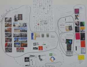
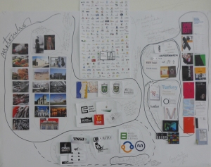
We were asked, for the first part of the workshop, to bring all the visual research we had, in stamp size format, so we could create a visual mapping of our Major Project’s field of study with the intent; as we add, search and subtract; of creating links between all the groups and subgroups within the field of study.
To create those links, a visual conversation was designed by dividing the field of study in three main groups: Branding, Câmara de Matosinhos and Matosinhos and by organizing the information in a rational disposition: the search about Matosinhos on the left, containing images from buildings, iconic places, industry and people from Matosinhos; the Branding search on the right, with bibliography and branding examples that have characteristics that are wanted for the Major Project and in the center, where this two fields intersect, we placed on the top center images from other city hall’s identities, on the center graphic representations from the city of Matosinhos and its city hall and on the bottom center, images from regional identities to contextualize and that could appear in graphic supports next to the identity to be worked in the Major Project.
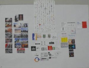
In the first day’s afternoon, Pedro Carvalho de Almeida gave us the free afternoon so we could gather the information we thought it was missing, advising a special attention towards bibliography with an interesting tip: choosing our references as we were choosing them for a big debate on our Major Project or a series of lectures on the field of study. As it was the main gap on the branding research, it turned out to be the biggest concern while researching, and it paid off, the bibliography references went from two to fourteen, including books and dissertations.
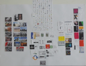
In the second day, Pedro spoke individually with all of us, and after explaining how the mapping was firstly thought and organized, not only his conversation helped the structuring of the next steps for this work in progress project but also the actions, the definition of new groups and subgroups, their proper naming and a better organized disposition.
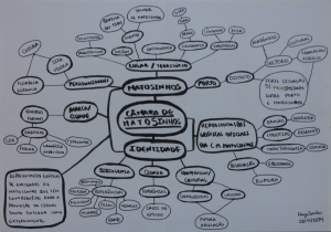
After this review, the field of study’s three main groups were divided in this subgroups:
Benchmarks on City Branding
Direct References for the Major Project.
Benchmarks on Cultural Branding
Characteristics/Values References.
Bibliography
Câmara de Matosinhos’ Official Graphic Representations
Coat of Arms: Heraldic.
Logotype: Drawing.
Map/Topography: Silhouette.
District: Porto
(Secondary Information)
Strong proximity between Matosinhos and Porto:
Sectors: Academic, Cultural, Public Transports…
Graphic Representation of Entities from Matosinhos
Contribute for the city’s promotion externally and internally.
Personalities related to Matosinhos
Part of Portugal’s Culture.
Place / Territory
Iconic Places: Architecture, Design, Events, Gastronomy, Geography, Industry…
The Idea and Importance of a City Brand
(Analysis of Formal Questions)
Brand’s Context/Function: City Hall, Commercial, Touristic…
Graphic Questions: Color, Expressive Grammar, Shape, Typography…
Pedro’s main advise was to not see this project as a final piece but as the work in progress it is, and for that we should keep adding information and shape shifting the visual mapping as we discover new references, in order to create better visual conversations that can formulate new groups/subgroups, links and lists to prioritize content to a better contextualization of the Major Project.
In the last day, we were asked to design a typographic diagram, organizing the groups/subgroups and the respective links we discovered in the previous exercise and through the outline stroke and size, we should illustrate their importance.
In the end of the workshop, the main objective of connecting and identifying the various categories of information that compose the field of study is obviously not yet completely fulfilled, but it was a big help, this starting point can possibly project an orientation for the structure of the Major Project, an hypothetical index.
Pedro left us with a gift in the form of Seidel’s Quality Data Analysis:
Collecting – Noticing – Thinking.
Noticing – Thinking – Collecting.
Thinking – Collecting – Noticing.
A big thank you to Dr. Pedro Carvalho de Almeida, for his knowledge and time!
“A Global Masturbation”.
Options:
Visual Overdose!
Do You?
U. Minho – Graphic Identity
“A simplicidade da Forma, é o desejo da Inteligência”.
“The simplicity of Form, is the desire of Intelligence”.
–
Francisco Providência
Russell Bestley’s Workshop – Pt. 2, 3 & 4
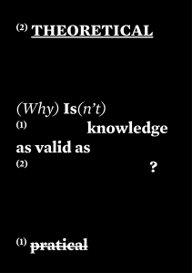
We were asked, for the second part of the workshop, to re-state our Research Question in less that 10 words and design this statement as an A2 typographic poster.
The Research Question was re-stated into a 2-in-1 question, that wanted not only to ask: “Is practical knowledge as valid as theoretical?”, but also to express the dissatisfaction raised by the discrediting felt to the project in comparison to theoretical projects: “Why isn’t practical knowledge as valid as theoretical?”.
The feedback was very helpful, even though it was already known that these two types of knowledge work together, Andrew and Russell underlined that and showed it was the wrong way to keep digging and then Miguel intervened constructively to the Research Question when we suggested this starting point: “What should a city identity look like?”, which finally cleared and demonstrated the true intention of these questions and that we also shouldn’t be scared of asking simple questions that give us simple answers because “No amount of ingenuity or creativity can create strong, clear, memorable design soultions from confused thought”.
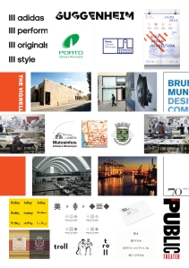
Secondly, using primary and secondary research, we had to show the context of our proposal as a visual construction, without the use of text and design the output as an A2 print using whatever tools we felt were appropriate.
A narrative was created by centering the city hall’s current logo, the city’s silhouette and coat of arms and surrounding these elements are photographs of some city locals, creating the first layer of our Field of Study, the city of Matosinhos and the second layer, the Branding layer, was constructed by gathering books and different graphic identities that have specific characteristics which bring something innovative and new to a logo.
Adidas Brand Design Study
City Sense Platform
Dimora Rurale Villino Odaldo
Himalayas Art Museum
Opera Australia
Porto.
Ridley
Suited Concepts Identity
The Hungarian Guggenheim
The Public Theater
TROLL
Thirdly, using visual methods and tools, we were asked to communicate not only three things that everyone knows about our subject but also three things that we have discovered about our subject which may surprise or confound expectations.
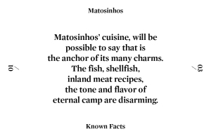
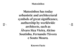
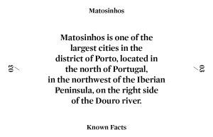
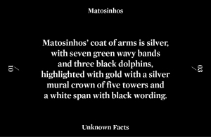
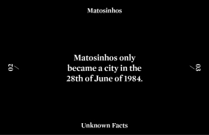
For this exercise, it was decided that both layers from the Field of Study: Branding and Matosinhos would be covered by designing business cards, element connected with branding/graphic identity, to be the support for presenting the facts about the city of Matosinhos, it was concluded that could be extracted richer information for the exercise.
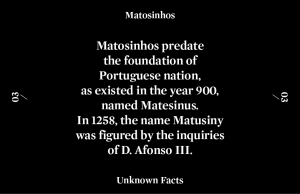
The business cards were black and white but with two different connotations, when the cards have white background and black typography it means clearness = known facts and when inverted it means mystery = unknown facts.
All the facts were chosen considering Russell’s advises about what can a city give to use in its graphic identity so we research in that direction and added a connotation to all of the facts, another perspective on such simple facts:
Design as Cuisine
Different Ingredients (Research Contents).
Produce one Final Plate (Major Project).
–
Provider of colors, shapes and textures.
Architecture as Inspiration
Matosinhos as its Silhouette
Heraldic Approach for Graphic Possibilities
Young City = Innovation
Transformation according to Time
Finally, we were asked to design an A2 poster that summarizes and communicates clearly our Research Question. This should be print be printed in a minimum of two colors, and should be primarily visual, with minimal supporting text – we should be able to articulate the problem that you are investigating solely though visual communication.
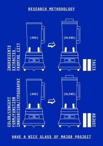
For this final exercise, our Research Question was again re-stated, and we ended up with something like this: “What can we Extract from a City and Use in its Graphic Identity?” and keeping with the analogy of Design as Cuisine, this poster was designed:
In the end of the presentation and Russell‘s review, the conclusion taken from the feedback about the poster, was again divided because even though he liked it as a graphic piece and noticed the hints in it, if he was an outsider who didn’t know anything about the project, his first impression would be that is was about cooking and its not even clear its about “Cooking a City Identity” but a Major Project and his main advises were to avoid the use of text and that it should be even more visual.
Russell left us with a gift in the form of three tips:
Ask One Question at a Time!
Star with a Question, End with a Better Question.
What’s the Next Question?
A big thank you to Dr. Russell Bestley, for his knowledge and time!

